Wednesday, December 19, 2018
New paper by Sam Flake and Peter Weisberg
Congratulations Sam Flake and Peter Weisberg on their new paper "Fine‐scale stand structure mediates drought‐induced tree mortality in pinyon–juniper woodlands" published this week in Ecological Applications. You can view their interesting and excellent paper HERE.
Wednesday, December 5, 2018
Miscellaneous Hydrology Tools for ArcGIS - Find Longest Stream Path
Here is part four of the blog post on the Miscellaneous Hydrology Tools for ArcGIS. This post covers a tool called the Find Longest Stream Path tool. You can read the original blog post by clicking HERE or download the tool be clicking HERE. It is the fourth and final in this series about the Miscellaneous Hydrology Tools.
 Surprisingly, there are no conventional tools in ArcMap that identify the longest stream in a watershed. However, many geomorphic metrics, such as relief ratio and watershed shape, are based on knowing what the longest stream is. In order rectify this situation I built a small model that calculates the longest stream. Unlike the other two tools in the Miscellaneous Hydrology Toolbox it does not provide an absolute answer. For reasons unknown to me occasionally some watersheds get left out. Nonetheless I feel that this tool is a useful and helpful addition that some people will enjoy having in their toolbox.
On the left is a sample of watersheds from central Nevada with the longest stream from each watershed shown in bold blue. All streams are shown in light blue. Watershed boundaries are in black. Pour points (those places where the stream exits the basin) are shown in green. Channel heads for the longest stream are shown in yellow.
There are four parameters for running this tool. A input flow stream flow direction tool is required for understanding flow routing. A standard flow direction raster can be clipped to the stream network to achieve this. Input watershed polygons are required. A temporary folder is required for storing outputs. Finally, a dissolve field (ID for example) is required. This should coincide with a field with the same name in the watersheds file.
 On the right is a picture of the model. Let me step you through how it works. For each stream flow direction cell the model calculates an upstream and downstream flow length. Using those flow lengths the model generates channel heads and pour points in each watershed. Using cost distance the model identifies the channel head with the greatest cost distance from the pour point. This becomes the end point. The combination of the end point and the pour point is used to create a least-cost path. Finally, grid cells are converted into flow lines.

On the left is a sample of watersheds from central Nevada with the longest stream from each watershed shown in bold blue. All streams are shown in light blue. Watershed boundaries are in black. Pour points (those places where the stream exits the basin) are shown in green. Channel heads for the longest stream are shown in yellow.
There are four parameters for running this tool. A input flow stream flow direction tool is required for understanding flow routing. A standard flow direction raster can be clipped to the stream network to achieve this. Input watershed polygons are required. A temporary folder is required for storing outputs. Finally, a dissolve field (ID for example) is required. This should coincide with a field with the same name in the watersheds file.

Thursday, November 22, 2018
Miscellaneous Hydrology Tools for ArcGIS - Trace Downstream Tool
Here is part three of the blog post on the Miscellaneous Hydrology Tools for ArcGIS. This post covers a tool called the Trace Downstream tool. You can read the original blog post by clicking HERE or download the tool be clicking HERE. Although there are tools in ArcGIS for tracing flows along vector networks there is no out-of-the-box tool for tracing downstream grid cells. That is where this tool comes in. Note that this tool uses a D8 flow algorithm. If there are diversions, like there might be in a vector-based hydrological network, then those won't show up. The assumption is that water flows downhill and that it is controlled entirely by topography.
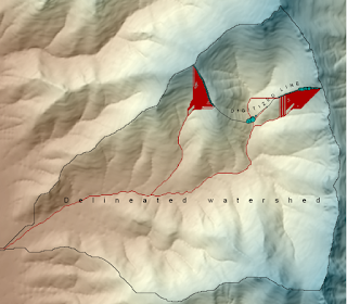
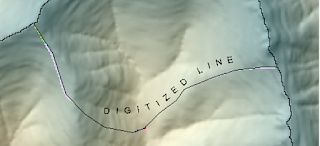
 In the picture on the left we have the output from the Find Inflow Cells Tool described in my November 12th post HERE. You can use any point(s) that you are interested in tracing downstream flow from. This is just an example that fits into a recent workflow that I used and illustrates how the two tools might work in tandem. The small blue dots represent points that I want to trace downstream. These are inflow cells when this little part of the watershed was cut off from the remaining watershed (e.g. digitized line on the map).
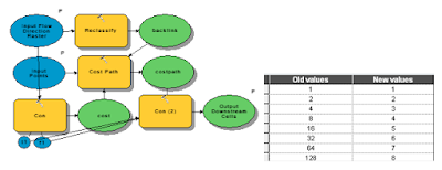
The picture below shows the guts of the model as you would view it from ArcGIS Model Builder. The Trace Flow Downstream is a fairly simple tool. Using the flow direction from the previous tool and the points this simple tool takes a flow direction raster and reclassifies it into a backlink raster and then traces the path using the cost path tool. The reclassification is shown above with flow direction values in the left column and backlink values in the right column.
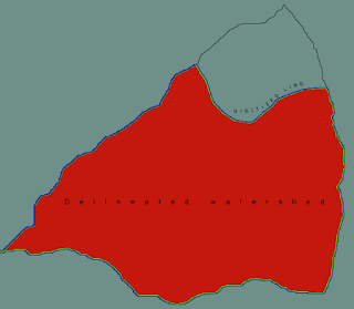
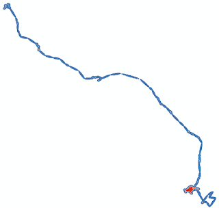
 The picture on the right shows the results of the Trace Downstream tool. Input points are the light blue points and red cells represent grid cells located downstream from those points. This tool could be used for a number of hydrological applications. For example, we may be interested in tracing a pollutant downstream. We may also be interested in identifying concentrated flow paths from overland flow. Finally we might want to use a tool such as this one to identify locations for placing erosion or pollutant control measures in order to maximize efficacy while controlling costs. For example, it might be most effective to place two to three measures in areas where flow is concentrated rather than dozens along the perimeter of the inflow area.

The picture below shows the guts of the model as you would view it from ArcGIS Model Builder. The Trace Flow Downstream is a fairly simple tool. Using the flow direction from the previous tool and the points this simple tool takes a flow direction raster and reclassifies it into a backlink raster and then traces the path using the cost path tool. The reclassification is shown above with flow direction values in the left column and backlink values in the right column.
 The picture on the right shows the results of the Trace Downstream tool. Input points are the light blue points and red cells represent grid cells located downstream from those points. This tool could be used for a number of hydrological applications. For example, we may be interested in tracing a pollutant downstream. We may also be interested in identifying concentrated flow paths from overland flow. Finally we might want to use a tool such as this one to identify locations for placing erosion or pollutant control measures in order to maximize efficacy while controlling costs. For example, it might be most effective to place two to three measures in areas where flow is concentrated rather than dozens along the perimeter of the inflow area.
Monday, November 12, 2018
Miscellaneous Hydrology Tools for ArcGIS - Find Inflow Cells Tool
Back in my September 29, 2018 post I promised a three part blog post on the Miscellaneous Hydrology Tools for ArcGIS. After a long absence here is part II - a detailed description of Find Inflow Cells Tool. You can read the original blog post by clicking HERE or download the tool be clicking HERE.
There are plenty of examples of situations in which we may want to figure out which cells flow in and which ones flow out of a watershed. Standard watershed tools, such as Basin in Spatial Analyst, will easily give us the outflow cells. Finding the inflow cells can be a little bit trickier, hence the reason for this new tool.
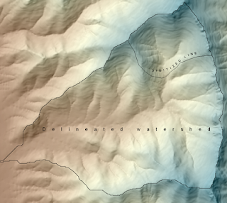 On the left is an example of a watershed in which I digitized a cut line that separates the northern 1/4 from the rest of the watershed. The goal in this example is the use the Find Inflow Cells tool to identify which cells from the northern 1/4 flow into the rest of the watershed. This could be useful for identifying likely entry points into a watershed. One scenario might be for a proposed development within a watershed in which we want to identify all entry points and mitigate for those by implementing some sort of erosion control. This tool would be well suited for those sorts of applications. If we were interested in identifying downslope cells that are likely to be affected then we may use this tool in conjunction with the Trace Downstream tool that I will cover in my next post.
 The image on the right illustrates the first step that the Find Inflow Cells undertakes. The entire watershed is rasterized and the Expand and Shrink tools in Spatial Analyst are used to generate an "inner buffer" and an "outer buffer". These are one cell wide buffers both inside and outside of the watershed. The inner buffer refers to the outermost cells within the watershed; candidates into which flow can occur. The outer buffer refers to the cells immediately adjacent from which flow can flow from. In the image on the right the outer buffer is blue and the inner buffer is green. The remaining cells in the watershed are red and the cells outside the watershed are gray.
 The image on the left shows the model as seen in ModelBuilder. Bear with me as I know that it is a little difficult to read. If you are really interested in the inner workings of this tool or any other I'd encourage you to crack open the model in ModelBuilder and examine the steps on your own computer. You'll see that it is actually quite repetitive and not nearly as complicated as it looks. It performs the standard hydrologic steps of filling the DEM, calculating flow direction, and calculating flow accumulation. Then the tool shifts the flow direction, flow accumulation, and outer buffer rasters in each of the eight directions. The following types of raster calculator statements are used to determine if a cell has positive inflow: ("%inner%" * "%ne_con%" * (Con("%ne_fdr%" == 8,1,0)))*8. A value of 8 is used to determine flow from the northeast to southwest directions. This is repeated for all of the directions using values of 16, 32, 64, 128, 1, 2, and 4 to represent the east, southeast, south, southwest, west, northwest, and north neighbors. A similar, but simpler, statement is used for flow accumulation: ("%inner%" * "%ne_con%"*"%ne_fac%"). Finally, values are summed to produce the flowdirection2 raster and then reclassified into 1 and 0 to produce the flowdirection1 raster. Similarly, flow accumulations are summed. Finally, the raster cells with inflow are converted to points.
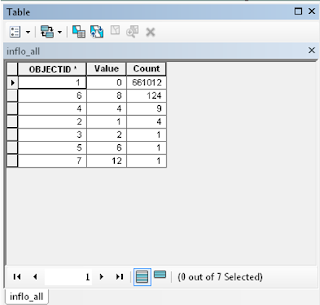 Inflow2 and Inflow1 differ, because Inflow2 can be used to determine which cells flow into the focal cell. Inflow1, in contrast, just codes all cells with inflow as 1 and all cells that have no inflow as 0. In the example table in the left image most cells have no inflow or are not boundary cells (99.9%). The most common direction of inflow is from the northeast (value=8), followed by north, east, and southeast. The values of 6 and 12 are not values of flow direction, but rather represent combinations of two values. Six is most likely a combination of 1 north and 1 east flowing cell. Twelve is most likely a combination of 8 and 4 representing northeast and north respectively.
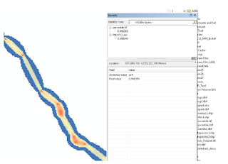
 The image on the right shows the spatial representation of the attribute table shown above. This is the Inflow2 raster. The lilac color represents flow crossing the barrier from northeast to southwest. The next most common color green representing flow from north to south. The cell at the bottom of the drainage that is red represents flow from the northwest to southeast.
 The image to the right shows the Inflow1 raster. It represents cells with inflow and are shown as bright green. Cells around the perimeter of the watershed have no inflow because the watershed was defined using standard hydrological tools in Spatial Analyst (Fill, Flow Direction, Flow Accumulation, and Watershed).
 In the picture on the left inflow cells are colored by flow accumulation. Most of the cells with inflow (blue) are located close to ridges but contribute less flow than cells in the valley bottom (red).
 In the picture at the bottom of the page cells have been converted into points which are shown as graduated symbols. Larger dots represent more flow than small dots. As can be seen the cells with the most inflow are located in the valley bottom.
This is it for this week. Next up will be a post on the Trace Downstream Tool, which is a companion and extension for this tool.
There are plenty of examples of situations in which we may want to figure out which cells flow in and which ones flow out of a watershed. Standard watershed tools, such as Basin in Spatial Analyst, will easily give us the outflow cells. Finding the inflow cells can be a little bit trickier, hence the reason for this new tool.


Individual flow directions can be obtained by running the tool from the ModelBuilder dialog window (right-click and select edit). This is an optional, but potentially useful, step that some advanced users may be interested in.


This is it for this week. Next up will be a post on the Trace Downstream Tool, which is a companion and extension for this tool.
Tuesday, November 6, 2018
Adoption of monarch models by the Western Association of Fish & Wildlife Agencies


I'm excited to announce that our draft manuscript is underway and that we expect submission soon.
Saturday, September 29, 2018
New tool - Miscellaneous Hydrology Tools for ArcGIS
I've got a new tool out. It is a collection of miscellaneous hydrology tools called, appropriately enough, Miscellaneous Hydrology Tools for ArcGIS. You can download it HERE. This toolbox runs in ArcMap and performs three specialized functions that augment the standard hydrology toolset in Spatial Analyst. These tools include 1) Find Inflow Cells, 2) Trace Path, and 3) Find Longest Stream in a Watershed. In the next three posts I intend to detail how these tools work and how they can be applied to solve common problems.


Thursday, August 30, 2018
Western Monarch and Milkweed Mapper - a great tool for all citizen scientists
I'd encourage everyone to visit the Western Monarch and Milkweed Mapper to log your monarch and milkweed sightings. The website is maintained by the Xerces Society, and the data contained withing it has been the primary source of data for our habitat mapping effort.
https://www.monarchmilkweedmapper.org
https://www.monarchmilkweedmapper.org/habitatsuitabilitymodels/
This morning I had the opportunity to join my daughter's second grade field trip to Betsy Donnelly Park where we spotted 3 narrowleaf milkweeds and 1 showy milkweed. I logged them on the mapper.
There will probably be a huge rush of data as the professional scientists post their findings this fall, but it is really exciting and interesting to see monarch sightings in real time, so I'd encourage all of you citizen scientists and monarch lovers to post throughout the season.

Wednesday, August 29, 2018
Paper assigned to an issue - Contrasting climate niches among co‐occurring subdominant forbs of the sagebrush steppe
Our paper "Contrasting climate niches among co‐occurring subdominant forbs of the sagebrush steppe" has been assigned to an issue in Diversity and Distributions. It will be Barga, S.C., Dilts, T.E., & Leger, E.A. (2018) Contrasting climate niches among co‐occurring subdominant forbs of the sagebrush steppe. Diversity and Distributions, 24(9): 1291-1307. Good work Sarah!
Friday, August 24, 2018
New tool - Create Percentiles Raster and Identify Stopovers
One of the most common tasks is habitat modeling, animal movement modeling, etc. is creating a percentile raster from a raw output. I created a small tool that will do this and identify animal stopovers from Brownian Bridge Movement Models (BBMM). The tool works in ArcGIS and is available HERE for download.
Here is an example of how the Identify Stopovers tool works. Thanks to Marcus Blum for providing test data and testing this tool.
First you start with a raster, probably continuous floating point values. In this case it is the ASCII raster output of Brownian Bridge Movement Models (BBMM).
After running the tool we get a percentile raster as one of the outputs. If you are just interested in getting a percentile raster you can run the Create Percentile Raster tool.

The maps look really similar, but if we compare them using the identify tool in ArcMap we can see that the original data has values that are different from the percentile raster.
Finally, we get two polygons called "stopovers1" and "stopovers2". The difference between these two stopovers files is that stopovers1 includes small stopovers. In contrast, stopovers2 omits stopovers that consist of only a handful of cells.
Here is an example of how the Identify Stopovers tool works. Thanks to Marcus Blum for providing test data and testing this tool.
First you start with a raster, probably continuous floating point values. In this case it is the ASCII raster output of Brownian Bridge Movement Models (BBMM).

After running the tool we get a percentile raster as one of the outputs. If you are just interested in getting a percentile raster you can run the Create Percentile Raster tool.

The maps look really similar, but if we compare them using the identify tool in ArcMap we can see that the original data has values that are different from the percentile raster.

Finally, we get two polygons called "stopovers1" and "stopovers2". The difference between these two stopovers files is that stopovers1 includes small stopovers. In contrast, stopovers2 omits stopovers that consist of only a handful of cells.

Thursday, August 16, 2018
Dot mapping as an alternative to raster maps
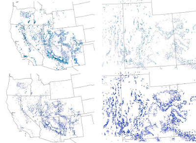
Recently I was helping a colleague with a mapping problem. The basic problem was that we had high resolution raster maps of climate data, but a very discontinuous study area with lots of holes. This made visualizing color gradations difficult. I tried coarsening the raster with some success, but it still didn't look the way I was hoping. I also tried a 3x3 filter to smooth the data and fill in gaps. That made the map look worse! Finally I resorted to converting each raster cell to a point and depicting it that way on the map. I found the the dot map was much easier to control and that the map was much easier to interpret. Take a look at the map below. The top row shows the dot approach and the bottom row shows the raster. The left column is the entire study area and the right is a blow up of Utah. One of the nice options is to use the advanced symbology tab in ArcMap to draw the rarer higher values on top. Let me know what you think.

Friday, July 13, 2018
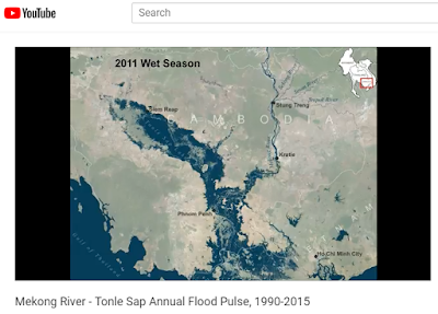
Animation of the Mekong River - Tonle Sap flood pulse
Southeast Asia experiences dramatic swings in precipitation and river flows as a result of the Asian monsoon. Nowhere is this more dramatic than the Mekong River flowing through Cambodia and Vietnam. In Cambodia the mighty Mekong River winds its way across a vast flood plain. During the rainy season the flow of the Mekong increases so much that it reverses the flow of the Tonle Sap River increasing the size of the Tonle Sap Lake by 6 times or more. This animation shows the heart beat of the Mekong River, the annual flood pulse using data derived from Landsat satellites from 1990 to 2015. Some years are omitted due to cloud cover.
To view the animation on YouTube click HERE
To view the animation on YouTube click HERE

New paper - Cheatgrass Die-Offs: A Unique Restoration Opportunity in Northern Nevada
Owen Baughman recently authored "Cheatgrass Die-Offs: A Unique Restoration Opportunity in Northern Nevada" in the journal Rangelands. This nice short piece highlights some of the restoration opportunities presented by cheatgrass die-offs. Cheatgrass die-off is a term that refers when a whole stand of cheatgrass fails to regenerate due to a pathogen. Usually this results in nearly complete lack of regeneration which can clearly be seen from both high resolution imagery and moderate resolution imagery, such as Landsat. Owen completed his master's thesis in 2014. I'd expect several papers related to his thesis out soon.
This paper also highlights some of the findings from our more detailed paper on remote sensing of cheatgrass die-offs "Development of remote sensing indicators for mapping episodic die-off of an invasive annual grass (Bromus tectorum) from the Landsat archive" in Ecological Indicators. The Great Basin Landscape Ecology Lab continues to explore ways in which remote sensing can be used to map cheatgrass die-offs across the Great Basin and to use imagery to quantify spatial pattern and relate it to climatic and other abiotic factors. Joe Brehm is a current master's student in the lab who is focusing on remote sensing of cheatgrass die-offs for his thesis. I'm looking forward to seeing Joe's findings.

Tuesday, March 27, 2018
New paper - Contrasting climate niches among co-occurring sub-dominant forbs of the sagebrush steppe
Sarah Barga, Beth Leger, and myself just got a paper accepted in Diversity and Distributions! It is titled "Contrasting climate niches among co-occurring sub-dominant forbs of the sagebrush steppe". The paper projects species distribution models for ten sub-dominant herbaceous forbs in the Great Basin. We then looked at niche overlap and found very little between the ten species. There was no relationship between phylogentic distance and niche overlap. We also looked at how species responded to temperature and precipitation variability and found that there were differences among different life forms. We hope that our paper findings will help conservationists understand which species may be more or less suitable to climatic variability.


Monday, March 26, 2018
Blended image to classification in ArcMap
A while back I did a vegetation classification in ArcMap using data collected from a drone. The method was fairly simple and I was pretty pleased with the result. I wanted to simultaneously display the image and the classified map. I had seen some pretty nifty blended images on the web that were created in Photoshop, but since I don't have Photoshop on my computer I opted to try to figure out how to do this in ArcMap. In general, I followed the steps to this tutorial - https://blogs.esri.com/esri/arcgis/2008/10/14/fade-to-white-background-effect/
However, I took some liberties and deviated from it a bit. My classification was a raster so in order to accommodate that I sliced the raster up into discrete slices going from north to south. For each raster I set the transparency to increase by 7%. Likewise I did the same with the segment outlines (the black lines).
Below is the resulting image. In case you are interested in the actual vegetation here is what each color represents: blue = sagebrush, green = other shrub, pink = cheatgrass+forbs, tan = bare soil, and gray = dead shrub (rare in this image). The UAV image was take by AboveGeo near Doyle, California. The upper portion of the image is intact sagebrush desert while the lower part was previously burned.

Saturday, March 3, 2018
New tool - Patch and Gap Metrics Toolbox for ArcGIS
 |
Forest ecologists, vegetation ecologists, and others are
frequently interested in characterizing the structure of patches and gaps on
the landscape. Typically, data, such as tree crown size, are collected in
quadrats. In order to synthesize these data for each quadrat I developed the Patch
and Gap Metrics Toolbox for ArcGIS. This tool takes polygons of quadrats
combined with polygons of representing tree crowns, shrub crowns, or some other
patch on the landscape, and calculates the number of patches and area of those
patches as well as gaps. There is a version of the tool that allows the user to
specify a radius to filter the gaps by in order to ensure that only large gaps
are included in the output. You can download the tool by clicking HERE.
The Patch and Gap Metrics Toolbox only requires two input
layers: 1) a polygon shapefile of patches (need not be dissolved) and 2) a
polygon shapefile of quadrats. The quadrats can be any shape or size and can
even be overlapping. In addition to this the quadrat polygons need a quadrat ID
field upon which dissolving can be based on. Finally, for the version of the
tool that accommodates additional gap size criteria there is a parameter that
specifies the radius of gaps to be considered. For example, a value of 6 would
eliminate any gaps with a diameter less than 12.

Above: There are two inputs required by the Patch and Gap
Metrics Toolbox. The picture on the left shows a polygon shapefile representing
the patches. Note that adjacent patches do not need to be merged. The tool will
do this automatically. The picture on the right shows overlapping quadrats.
Quadrats need not be overlapping.
The main output of this tool is a point shapefile
representing the centroid of each quadrat that is attributed with the following
fields:
COUNT_SHAPE – Count of the number of patches
SUM_ SHAPE – Total area of the patches in the quadrat
MEAN_ SHAPE – Average size of the patches in the quadrat
STD_ SHAPE – Standard deviation of the patches in the quadrat
MIN_SHAPE – Minimum number of patches in the quadrat
MAX_SHAPE - Maximum number of patches in the quadrat
SUM_ SHAPE1 - Total perimeter of patches in the quadrat
COUNT_SHAP_1 – Count of the number of gaps
SUM_ SHAP_1 - Total area of the gaps in the quadrat
MEAN_ SHAP_1 - Average size of the gaps in the quadrat
STD_ SHAP_1 – Standard deviation of the patches in the quadrat
MIN_ SHAP_1 - Minimum number of patches in the quadrat
MAX_ SHAP_1 - Maximum number of patches in the quadrat
SUM_ SHAP_2 – Total perimeter of gaps in the quadrat
In addition to attributing each quadrat centroid with the above values there are also two additional outputs. In the image below the darker green polygons with red outlines show patches as generated by this tool. The tan polygons with purple outlines show the gaps using a 6 meter radius filter. The remaining light green areas are classified as neither patch nor gap.
|
Tuesday, January 23, 2018
New tool - spider diagrams for ArcMap

Spider lines depict Euclidean distance-based routes that connect each pair of points. They are a useful tool for visualization. In landscape genetics this represents the isolation-by-distance hypothesis. Previously there were other 3rd party tools that achieved this on the Arcscripts website. Currently it appears that this functionality is only available with a Business Analyst license of ArcGIS. This tool make a few assumptions:
1. You wish to connect all pairs of points
2. You have a point shapefile
3. The point shapefile is in a projected coordinate system
4. The point shapefile has fields called "Easting" and "Northing" that represent the X and Y coordinates respectively. If these fields are not named this excatly then the tool will fail
5. You have a field that describes the name of the pairs of the site (point).
Please do not use a geodatabase feature class.
Output line shapefile (or geodatabase if you specify that) attributed with the following:
1. Input FID
2. Easting
3. Northing
4. Easting_1
5. Northing_1
6. Near_FID
7. Site
8. Site_1
If you end up using this tool for published work please feel free to cite this as:
Dilts, T.E. (2018) Spider Diagram Tools for ArcGIS (insert your version here). University of Nevada Reno, Available at: https://www.arcgis.com/home/item.html?id=fb7d157782a549b182c957abbaaf45c2.
You can download the tool by clicking HERE.
Subscribe to:
Comments (Atom)