Thursday, August 30, 2018

Western Monarch and Milkweed Mapper - a great tool for all citizen scientists

I'd encourage everyone to visit the Western Monarch and Milkweed Mapper to log your monarch and milkweed sightings.  The website is maintained by the Xerces Society, and the data contained withing it has been the primary source of data for our habitat mapping effort.

https://www.monarchmilkweedmapper.org
https://www.monarchmilkweedmapper.org/habitatsuitabilitymodels/

This morning I had the opportunity to join my daughter's second grade field trip to Betsy Donnelly Park where we spotted 3 narrowleaf milkweeds and 1 showy milkweed.  I logged them on the mapper.

There will probably be a huge rush of data as the professional scientists post their findings this fall, but it is really exciting and interesting to see monarch sightings in real time, so I'd encourage all of you citizen scientists and monarch lovers to post throughout the season.


Friday, August 24, 2018

New tool - Create Percentiles Raster and Identify Stopovers

One of the most common tasks is habitat modeling, animal movement modeling, etc. is creating a percentile raster from a raw output. I created a small tool that will do this and identify animal stopovers from Brownian Bridge Movement Models (BBMM). The tool works in ArcGIS and is available HERE for download.

Here is an example of how the Identify Stopovers tool works. Thanks to Marcus Blum for providing test data and testing this tool.

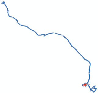
First you start with a raster, probably continuous floating point values. In this case it is the ASCII raster output of Brownian Bridge Movement Models (BBMM).

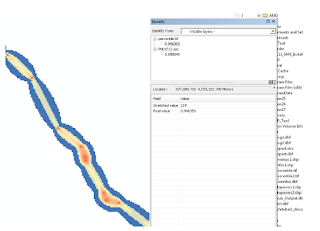
After running the tool we get a percentile raster as one of the outputs. If you are just interested in getting a percentile raster you can run the Create Percentile Raster tool.


The maps look really similar, but if we compare them using the identify tool in ArcMap we can see that the original data has values that are different from the percentile raster.


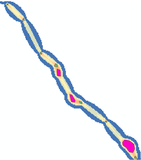
Finally, we get two polygons called "stopovers1" and "stopovers2". The difference between these two stopovers files is that stopovers1 includes small stopovers. In contrast, stopovers2 omits stopovers that consist of only a handful of cells.


Thursday, August 16, 2018

Dot mapping as an alternative to raster maps

Recently I was helping a colleague with a mapping problem. The basic problem was that we had high resolution raster maps of climate data, but a very discontinuous study area with lots of holes.  This made visualizing color gradations difficult.  I tried coarsening the raster with some success, but it still didn't look the way I was hoping.  I also tried a 3x3 filter to smooth the data and fill in gaps.  That made the map look worse!  Finally I resorted to converting each raster cell to a point and depicting it that way on the map.  I found the the dot map was much easier to control and that the map was much easier to interpret.  Take a look at the map below.  The top row shows the dot approach and the bottom row shows the raster.  The left column is the entire study area and the right is a blow up of Utah.  One of the nice options is to use the advanced symbology tab in ArcMap to draw the rarer higher values on top. Let me know what you think.