
Saturday, September 29, 2018
New tool - Miscellaneous Hydrology Tools for ArcGIS
I've got a new tool out. It is a collection of miscellaneous hydrology tools called, appropriately enough, Miscellaneous Hydrology Tools for ArcGIS. You can download it HERE. This toolbox runs in ArcMap and performs three specialized functions that augment the standard hydrology toolset in Spatial Analyst. These tools include 1) Find Inflow Cells, 2) Trace Path, and 3) Find Longest Stream in a Watershed. In the next three posts I intend to detail how these tools work and how they can be applied to solve common problems.

Thursday, August 30, 2018
Western Monarch and Milkweed Mapper - a great tool for all citizen scientists
I'd encourage everyone to visit the Western Monarch and Milkweed Mapper to log your monarch and milkweed sightings. The website is maintained by the Xerces Society, and the data contained withing it has been the primary source of data for our habitat mapping effort.
https://www.monarchmilkweedmapper.org
https://www.monarchmilkweedmapper.org/habitatsuitabilitymodels/
This morning I had the opportunity to join my daughter's second grade field trip to Betsy Donnelly Park where we spotted 3 narrowleaf milkweeds and 1 showy milkweed. I logged them on the mapper.
There will probably be a huge rush of data as the professional scientists post their findings this fall, but it is really exciting and interesting to see monarch sightings in real time, so I'd encourage all of you citizen scientists and monarch lovers to post throughout the season.

Wednesday, August 29, 2018
Paper assigned to an issue - Contrasting climate niches among co‐occurring subdominant forbs of the sagebrush steppe
Our paper "Contrasting climate niches among co‐occurring subdominant forbs of the sagebrush steppe" has been assigned to an issue in Diversity and Distributions. It will be Barga, S.C., Dilts, T.E., & Leger, E.A. (2018) Contrasting climate niches among co‐occurring subdominant forbs of the sagebrush steppe. Diversity and Distributions, 24(9): 1291-1307. Good work Sarah!
Friday, August 24, 2018
New tool - Create Percentiles Raster and Identify Stopovers
One of the most common tasks is habitat modeling, animal movement modeling, etc. is creating a percentile raster from a raw output. I created a small tool that will do this and identify animal stopovers from Brownian Bridge Movement Models (BBMM). The tool works in ArcGIS and is available HERE for download.
Here is an example of how the Identify Stopovers tool works. Thanks to Marcus Blum for providing test data and testing this tool.
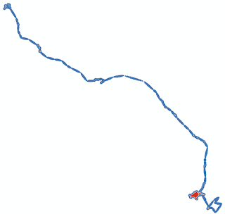
First you start with a raster, probably continuous floating point values. In this case it is the ASCII raster output of Brownian Bridge Movement Models (BBMM).
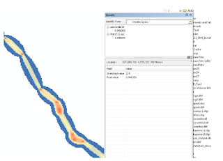
After running the tool we get a percentile raster as one of the outputs. If you are just interested in getting a percentile raster you can run the Create Percentile Raster tool.

The maps look really similar, but if we compare them using the identify tool in ArcMap we can see that the original data has values that are different from the percentile raster.
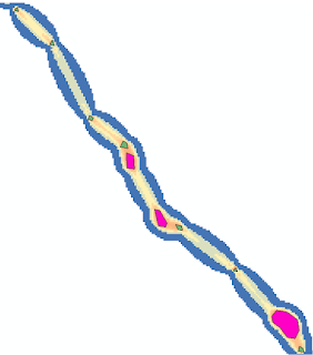
Finally, we get two polygons called "stopovers1" and "stopovers2". The difference between these two stopovers files is that stopovers1 includes small stopovers. In contrast, stopovers2 omits stopovers that consist of only a handful of cells.
Here is an example of how the Identify Stopovers tool works. Thanks to Marcus Blum for providing test data and testing this tool.
First you start with a raster, probably continuous floating point values. In this case it is the ASCII raster output of Brownian Bridge Movement Models (BBMM).

After running the tool we get a percentile raster as one of the outputs. If you are just interested in getting a percentile raster you can run the Create Percentile Raster tool.

The maps look really similar, but if we compare them using the identify tool in ArcMap we can see that the original data has values that are different from the percentile raster.

Finally, we get two polygons called "stopovers1" and "stopovers2". The difference between these two stopovers files is that stopovers1 includes small stopovers. In contrast, stopovers2 omits stopovers that consist of only a handful of cells.

Thursday, August 16, 2018
Dot mapping as an alternative to raster maps
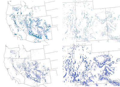
Recently I was helping a colleague with a mapping problem. The basic problem was that we had high resolution raster maps of climate data, but a very discontinuous study area with lots of holes. This made visualizing color gradations difficult. I tried coarsening the raster with some success, but it still didn't look the way I was hoping. I also tried a 3x3 filter to smooth the data and fill in gaps. That made the map look worse! Finally I resorted to converting each raster cell to a point and depicting it that way on the map. I found the the dot map was much easier to control and that the map was much easier to interpret. Take a look at the map below. The top row shows the dot approach and the bottom row shows the raster. The left column is the entire study area and the right is a blow up of Utah. One of the nice options is to use the advanced symbology tab in ArcMap to draw the rarer higher values on top. Let me know what you think.

Friday, July 13, 2018
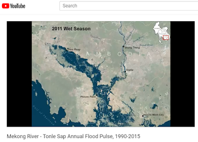
Animation of the Mekong River - Tonle Sap flood pulse
Southeast Asia experiences dramatic swings in precipitation and river flows as a result of the Asian monsoon. Nowhere is this more dramatic than the Mekong River flowing through Cambodia and Vietnam. In Cambodia the mighty Mekong River winds its way across a vast flood plain. During the rainy season the flow of the Mekong increases so much that it reverses the flow of the Tonle Sap River increasing the size of the Tonle Sap Lake by 6 times or more. This animation shows the heart beat of the Mekong River, the annual flood pulse using data derived from Landsat satellites from 1990 to 2015. Some years are omitted due to cloud cover.
To view the animation on YouTube click HERE
To view the animation on YouTube click HERE

New paper - Cheatgrass Die-Offs: A Unique Restoration Opportunity in Northern Nevada
Owen Baughman recently authored "Cheatgrass Die-Offs: A Unique Restoration Opportunity in Northern Nevada" in the journal Rangelands. This nice short piece highlights some of the restoration opportunities presented by cheatgrass die-offs. Cheatgrass die-off is a term that refers when a whole stand of cheatgrass fails to regenerate due to a pathogen. Usually this results in nearly complete lack of regeneration which can clearly be seen from both high resolution imagery and moderate resolution imagery, such as Landsat. Owen completed his master's thesis in 2014. I'd expect several papers related to his thesis out soon.
This paper also highlights some of the findings from our more detailed paper on remote sensing of cheatgrass die-offs "Development of remote sensing indicators for mapping episodic die-off of an invasive annual grass (Bromus tectorum) from the Landsat archive" in Ecological Indicators. The Great Basin Landscape Ecology Lab continues to explore ways in which remote sensing can be used to map cheatgrass die-offs across the Great Basin and to use imagery to quantify spatial pattern and relate it to climatic and other abiotic factors. Joe Brehm is a current master's student in the lab who is focusing on remote sensing of cheatgrass die-offs for his thesis. I'm looking forward to seeing Joe's findings.

Subscribe to:
Comments (Atom)