
Thursday, August 16, 2018
Dot mapping as an alternative to raster maps
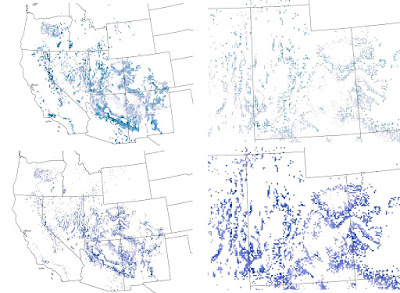
Recently I was helping a colleague with a mapping problem. The basic problem was that we had high resolution raster maps of climate data, but a very discontinuous study area with lots of holes. This made visualizing color gradations difficult. I tried coarsening the raster with some success, but it still didn't look the way I was hoping. I also tried a 3x3 filter to smooth the data and fill in gaps. That made the map look worse! Finally I resorted to converting each raster cell to a point and depicting it that way on the map. I found the the dot map was much easier to control and that the map was much easier to interpret. Take a look at the map below. The top row shows the dot approach and the bottom row shows the raster. The left column is the entire study area and the right is a blow up of Utah. One of the nice options is to use the advanced symbology tab in ArcMap to draw the rarer higher values on top. Let me know what you think.
Subscribe to:
Post Comments (Atom)
No comments:
Post a Comment