Showing posts with label flow direction. Show all posts

Tuesday, April 28, 2020

Height Above Nearest Drainage goes mainstream in QGIS and ArcGIS

Between 2008 and 2016 Camilo Rennó and Antonio Nobre and co-authors published a series of papers describing "Height Above Nearest Drainage" (HAND), an approach for measuring the height above a mapped stream channel. Their approach basically involves identifying watersheds for each cell in a stream and relating that the to the upslope area through a join.  HAND is defined, more of less, as the difference between the elevation of a grid cell and the downslope elevation where it flows into the stream.

In 2011 I created an ArcGIS Toolbox called the "Riparian Topography Toolbox" and added a tool to calculate HAND. Height Above Nearest Drainage differs "Height Above River", which is calculated as the difference in elevation between a grid cell and a weighted average of grid cells within a stream. The two methods are conceptually similar although HAR uses multiple grid cells within a river.  Hence, it is more appropriate for deriving vertical height for LIDAR DEMs rather than typ
ical 10 or 30 meter DEMs.  HAND, on the other hand, is expected to be more computationally-efficient and more appropriate on coarser-scale DEMs.

As of ArcGIS version 10.7.1, I noticed that ArcGIS is now including a tool called "Flow Distance" in the Hydrology Toolset in ArcToolbox. This tool has an option for calculating distance in either horizontal or vertical distances. The vertical option appears to be equivalent to HAND so I decided to check it out.  I ran the "Flow Distance" tool on some of my study watersheds to see what the output looks like. The image on the left shows five sample watersheds with streams in blue, pour points as red dots, and watershed boundaries in black. The output from the Flow Distance tool is shown as a yellow to green to blue color ramp.

The image on the right shows the output from Flow Distance after thresholding into two classes: above and below 15 meters vertical height above stream channels. Purples are the areas below 15 meters and tan are the areas above 15 meters. You can see the some watersheds tend to have narrower riparian areas than others.

QGIS has an equivalent version of this tool.  It is called Terrain Channels and it also has a vertical component.

ArcGIS Flow Distance - https://desktop.arcgis.com/
en/arcmap/latest/tools/spatial-analyst-toolbox/flow-distance.html


QGIS Terrain channels - https://docs.qgis.org/2.18/ en/docs/user_manual/processing_algs /saga/terrain_analysis_channels.html

Rennó, C. D., Nobre, A. D., Cuartas, L. A., Soares, J. V., Hodnett, M. G., & Tomasella, J. (2008). HAND, a new terrain descriptor using SRTM-DEM: Mapping terra-firme rainforest environments in Amazonia. Remote Sensing of Environment, 112(9), 3469-3481.

Nobre, A. D., Cuartas, L. A., Hodnett, M., Rennó, C. D., Rodrigues, G., Silveira, A., & Saleska, S. (2011). Height Above the Nearest Drainage – a hydrologically relevant new terrain model. Journal of Hydrology, 404(1-2), 13-29.

Nobre, A. D., Cuartas, L. A., Momo, M. R., Severo, D. L., Pinheiro, A., & Nobre, C. A. (2016). HAND contour: a new proxy predictor of inundation extent. Hydrological Processes, 30(2), 320-333.

Dilts, T. E., Yang, J., & Weisberg, P. J. (2010) Mapping Riparian Vegetation with Lidar Data Predicting plant community distribution using height above river and flood height. ArcUser Magazine - https://www.esri.com/news/arcuser/0110/mapping-with-lidar.html

Wednesday, December 5, 2018

Miscellaneous Hydrology Tools for ArcGIS - Find Longest Stream Path

Here is part four of the blog post on the Miscellaneous Hydrology Tools for ArcGIS. This post covers a tool called the Find Longest Stream Path tool. You can read the original blog post by clicking HERE or download the tool be clicking HERE. It is the fourth and final in this series about the Miscellaneous Hydrology Tools.

Surprisingly, there are no conventional tools in ArcMap that identify the longest stream in a watershed. However, many geomorphic metrics, such as relief ratio and watershed shape, are based on knowing what the longest stream is. In order rectify this situation I built a small model that calculates the longest stream. Unlike the other two tools in the Miscellaneous Hydrology Toolbox it does not provide an absolute answer.  For reasons unknown to me occasionally some watersheds get left out.  Nonetheless I feel that this tool is a useful and helpful addition that some people will enjoy having in their toolbox.

On the left is a sample of watersheds from central Nevada with the longest stream from each watershed shown in bold blue.  All streams are shown in light blue.  Watershed boundaries are in black. Pour points (those places where the stream exits the basin) are shown in green. Channel heads for the longest stream are shown in yellow.

There are four parameters for running this tool.  A input flow stream flow direction tool is required for understanding flow routing.  A standard flow direction raster can be clipped to the stream network to achieve this.  Input watershed polygons are required.  A temporary folder is required for storing outputs.  Finally, a dissolve field (ID for example) is required.  This should coincide with a field with the same name in the watersheds file.

On the right is a picture of the model.  Let me step you through how it works. For each stream flow direction cell the model calculates an upstream and downstream flow length. Using those flow lengths the model generates channel heads and pour points in each watershed. Using cost distance the model identifies the channel head with the greatest cost distance from the pour point. This becomes the end point. The combination of the end point and the pour point is used to create a least-cost path. Finally, grid cells are converted into flow lines.


Thursday, November 22, 2018

Miscellaneous Hydrology Tools for ArcGIS - Trace Downstream Tool

Here is part three of the blog post on the Miscellaneous Hydrology Tools for ArcGIS. This post covers a tool called the Trace Downstream tool. You can read the original blog post by clicking HERE or download the tool be clicking HERE. Although there are tools in ArcGIS for tracing flows along vector networks there is no out-of-the-box tool for tracing downstream grid cells.  That is where this tool comes in.  Note that this tool uses a D8 flow algorithm. If there are diversions, like there might be in a vector-based hydrological network, then those won't show up.  The assumption is that water flows downhill and that it is controlled entirely by topography.

In the picture on the left we have the output from the Find Inflow Cells Tool described in my November 12th post HERE. You can use any point(s) that you are interested in tracing downstream flow from. This is just an example that fits into a recent workflow that I used and illustrates how the two tools might work in tandem. The small blue dots represent points that I want to trace downstream. These are inflow cells when this little part of the watershed was cut off from the remaining watershed (e.g. digitized line on the map).

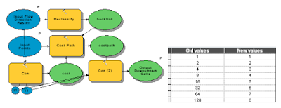
The picture below shows the guts of the model as you would view it from ArcGIS Model Builder.  The Trace Flow Downstream is a fairly simple tool.  Using the flow direction from the previous tool and the points this simple tool takes a flow direction raster and reclassifies it into a backlink raster and then traces the path using the cost path tool. The reclassification is shown above with flow direction values in the left column and backlink values in the right column.

The picture on the right shows the results of the Trace Downstream tool.  Input points are the light blue points and red cells represent grid cells located downstream from those points. This tool could be used for a number of hydrological applications. For example, we may be interested in tracing a pollutant downstream. We may also be interested in identifying concentrated flow paths from overland flow. Finally we might want to use a tool such as this one to identify locations for placing erosion or pollutant control measures in order to maximize efficacy while controlling costs. For example, it might be most effective to place two to three measures in areas where flow is concentrated rather than dozens along the perimeter of the inflow area.


Monday, November 12, 2018

Miscellaneous Hydrology Tools for ArcGIS - Find Inflow Cells Tool

Back in my September 29, 2018 post I promised a three part blog post on the Miscellaneous Hydrology Tools for ArcGIS. After a long absence here is part II - a detailed description of Find Inflow Cells Tool.  You can read the original blog post by clicking HERE or download the tool be clicking HERE.
There are plenty of examples of situations in which we may want to figure out which cells flow in and which ones flow out of a watershed.  Standard watershed tools, such as Basin in Spatial Analyst, will easily give us the outflow cells.  Finding the inflow cells can be a little bit trickier, hence the reason for this new tool.

On the left is an example of a watershed in which I digitized a cut line that separates the northern 1/4 from the rest of the watershed. The goal in this example is the use the Find Inflow Cells tool to identify which cells from the northern 1/4 flow into the rest of the watershed. This could be useful for identifying likely entry points into a watershed. One scenario might be for a proposed development within a watershed in which we want to identify all entry points and mitigate for those by implementing some sort of erosion control. This tool would be well suited for those sorts of applications.  If we were interested in identifying downslope cells that are likely to be affected then we may use this tool in conjunction with the Trace Downstream tool that I will cover in my next post.

The image on the right illustrates the first step that the Find Inflow Cells undertakes. The entire watershed is rasterized and the Expand and Shrink tools in Spatial Analyst are used to generate an "inner buffer" and an "outer buffer".  These are one cell wide buffers both inside and outside of the watershed. The inner buffer refers to the outermost cells within the watershed; candidates into which flow can occur. The outer buffer refers to the cells immediately adjacent from which flow can flow from. In the image on the right the outer buffer is blue and the inner buffer is green. The remaining cells in the watershed are red and the cells outside the watershed are gray.

The image on the left shows the model as seen in ModelBuilder. Bear with me as I know that it is a little difficult to read.  If you are really interested in the inner workings of this tool or any other I'd encourage you to crack open the model in ModelBuilder and examine the steps on your own computer. You'll see that it is actually quite repetitive and not nearly as complicated as it looks. It performs the standard hydrologic steps of filling the DEM, calculating flow direction, and calculating flow accumulation. Then the tool shifts the flow direction, flow accumulation, and outer buffer rasters in each of the eight directions. The following types of raster calculator statements are used to determine if a cell has positive inflow: ("%inner%" * "%ne_con%" * (Con("%ne_fdr%" == 8,1,0)))*8. A value of 8 is used to determine flow from the northeast to southwest directions.  This is repeated for all of the directions using values of  16, 32, 64, 128, 1, 2, and 4 to represent the east, southeast, south, southwest, west, northwest, and north neighbors.  A similar, but simpler, statement is used for flow accumulation: ("%inner%" * "%ne_con%"*"%ne_fac%").  Finally, values are summed to produce the flowdirection2 raster and then reclassified into 1 and 0 to produce the flowdirection1 raster.  Similarly, flow accumulations are summed. Finally, the raster cells with inflow are converted to points.


Inflow2 and Inflow1 differ, because Inflow2 can be used to determine which cells flow into the focal cell.  Inflow1, in contrast, just codes all cells with inflow as 1 and all cells that have no inflow as 0.  In the example table in the left image most cells have no inflow or are not boundary cells (99.9%). The most common direction of inflow is from the northeast (value=8), followed by north, east, and southeast. The values of 6 and 12 are not values of flow direction, but rather represent combinations of two values. Six is most likely a combination of 1 north and 1 east flowing cell. Twelve is most likely a combination of 8 and 4 representing northeast and north respectively.


The image on the right shows the spatial representation of the attribute table shown above. This is the Inflow2 raster.  The lilac color represents flow crossing the barrier from northeast to southwest. The next most common color green representing flow from north to south.  The cell at the bottom of the drainage that is red represents flow from the northwest to southeast.


The image to the right shows the Inflow1 raster. It represents cells with inflow and are shown as bright green.  Cells around the perimeter of the watershed have no inflow because the watershed was defined using standard hydrological tools in Spatial Analyst (Fill, Flow Direction, Flow Accumulation, and Watershed).


Individual flow directions can be obtained by running the tool from the ModelBuilder dialog window (right-click and select edit). This  is an optional, but potentially useful, step that some advanced users may be interested in.


 In the picture on the left inflow cells are colored by flow accumulation. Most of the cells with inflow (blue) are located close to ridges but contribute less flow than cells in the valley bottom (red).

In the picture at the bottom of the page cells have been converted into points which are shown as graduated symbols. Larger dots represent more flow than small dots. As can be seen the cells with the most inflow are located in the valley bottom.

This is it for this week.  Next up will be a post on the Trace Downstream Tool, which is a companion and extension for this tool.


Saturday, September 29, 2018

New tool - Miscellaneous Hydrology Tools for ArcGIS

I've got a new tool out.  It is a collection of miscellaneous hydrology tools called, appropriately enough, Miscellaneous Hydrology Tools for ArcGIS. You can download it HERE. This toolbox runs in ArcMap and performs three specialized functions that augment the standard hydrology toolset in Spatial Analyst. These tools include 1) Find Inflow Cells, 2) Trace Path, and 3) Find Longest Stream in a Watershed. In the next three posts I intend to detail how these tools work and how they can be applied to solve common problems.


Tuesday, April 21, 2015

Better flow accumulation with positive and negative weights

Most GIS users are probably familiar with calculating flow accumulation and many are probably also familiar with weighted flow accumulation. ArcMap, however, will not allow negative weights and this can be a severe limitation in some cases. Fortunately,  back in 2008 Bill Huber provided us with a simple yet elegant solution to this problem.  However, I've noticed that this problem tends to resurface from time to time on the forums. A while back I put together a geoprocessing model  to deal with this problem using Bill's solution which is available for download.

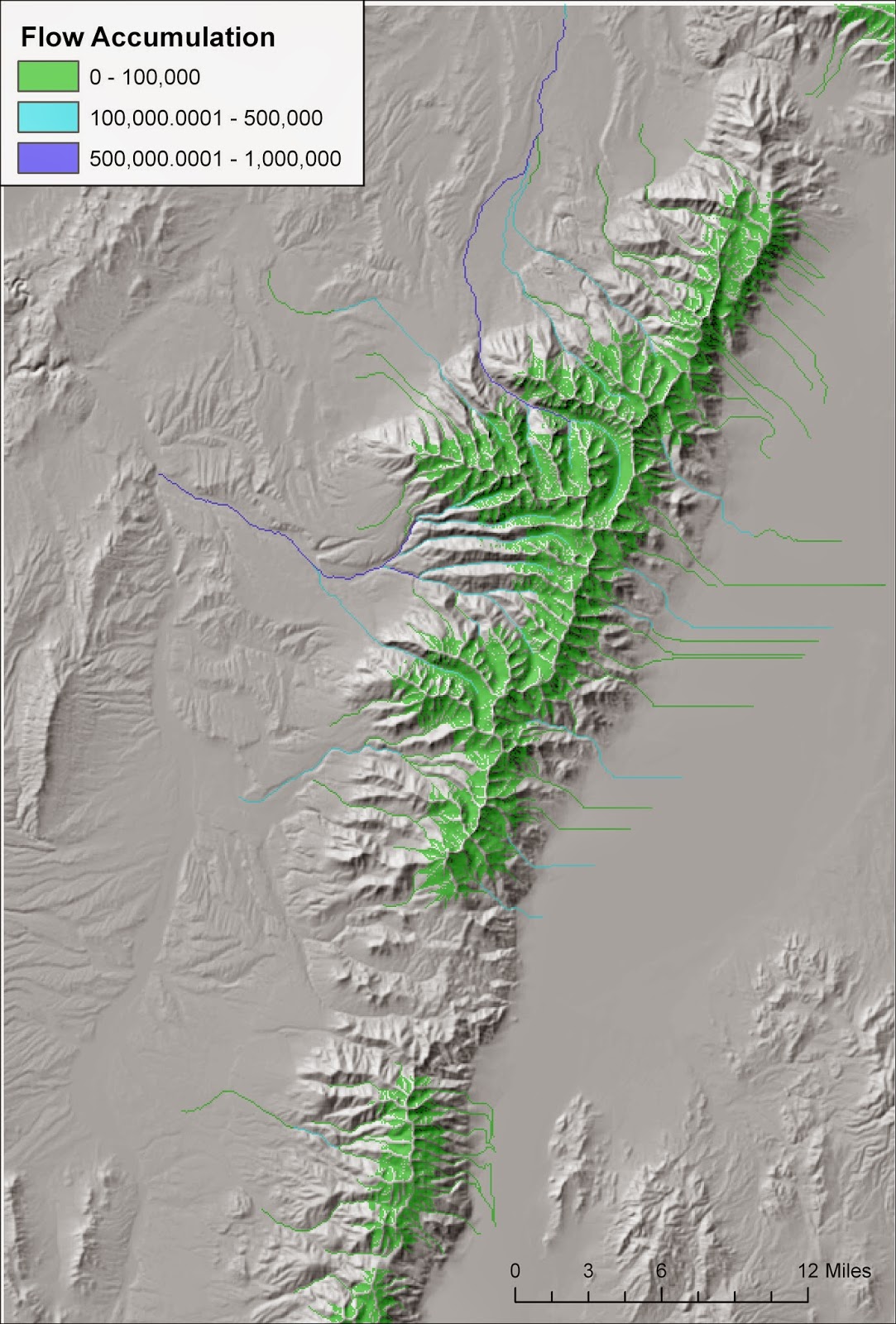
The map on the right illustrates how a tool, such as this one, might be used. I first performed the two operations that precede flow accumulation: filling sinks and calculating flow direction. In this case I used a 30 meter USGS NED DEM. Then using my new tool I used a weight raster that consisted of rain + snowmelt minus evapotranspiration. In areas with positive values water is being released into the environment. In contrast, negative values highlight areas where evaporation is  removing water from streams. In a typical flow accumulation operation flow accumulation only increases as one moves downstream. However, in arid environments we know that isn't true. Flows increase generally as one moves downstream due to multiple streams flowing into one another, but at some point flows begin to decrease because evaporation exceeds water inputs. The map above illustrates this in several places. Several streams flow out of the Ruby Mountains but many end when they flow into areas of high evaporation. Others flow off the map but  are diminished before they leave the map.

This example also demonstrates that streams could be treated as dynamic entities dependent upon both precipitation and temperature. The data for the map above was derived using the Climatic Water Deficit Toolbox for the month of June. Later in the summer months flows may be diminished and connectivity for fish species may be impacted. In contrast, during the wetter months streams may become more connected. Finally, I should note that for the one instance where I compared a result like this to an actual hydrograph it didn't stack up so well. The streams went dry mid-summer in the flow accumulation model yet actual hydrograph data showed greatly diminished but still existent flows due inputs from groundwater. Nonetheless, these sorts of dynamic flow accumulation models are likely to be better than standard static flow accumulation models.