There is a new(ish) report available on Research Gate - "Geomorphic Sensitivity and Ecological Resilience of Great Basin Streams and Riparian Ecosystems. Part I. Sensitivity and Resilience Concepts, Components, and Categories Part II. Assessment Protocol." You can access the report by clicking HERE. There is also a data publication that goes along with this report. It is "Geospatial data for Great Basin perennial montane watersheds - geomorphology, hydrology, vegetation, disturbance and species" and it is available by clicking HERE.
With this blog I intend to share GIS, remote sensing, and spatial analysis tips, experiences, and techniques with others. Most of my work is in the field of Landscape Ecology, so there is a focus on ecological applications. Postings include tips and suggestions for data processing and day-to-day GIS tasks, links to my GIS tools and approaches, and links to scientific papers that I've been involved in.
Friday, January 28, 2022
Thursday, January 27, 2022
New paper - Governing Ecological Connectivity in Cross-Scale Dependent Systems in Bioscience
Happy to announce that we have a new paper "Governing Ecological Connectivity in Cross-Scale Dependent Systems" published in Bioscience. The paper came about from a meeting in February of 2020 held by the Delta Stewardship Council in Davis, CA led by Annika Keeley. I'm thrilled to have gotten to participate in this very interdisciplinary meeting. You can view the paper by clicking HERE. The full citations is:
Keeley, A.T.H., Fremier, A.K., Goertler, P.A.L., Huber, P.R., Sturrock, A.M., Bashevkin, S.M., Barbaree, B.A., Grenier, J.L., Dilts, T.E., Gogol-Prokurat, M., Colombano, D.D., Bush, E.E., Laws, A., Gallo, J.A., Kondolf, M., Stahl, A.T. (2022) Governing Ecological Connectivity in Cross-Scale Dependent Systems, BioScience, https://doi.org/10.1093/biosci/biab140
Thursday, July 25, 2019
Edited wikipedia page of notable UNR people
Dwight Billings was a leading ecologist, was known as the "father" of physiological ecology, and was a major contributor in desert and arctic ecology. In Nevada he received the prestigious Nevada medal. You can read about him by clicking HERE. Below is a partial list of his many papers which focused on our region:
Billings, W. D. (1945). The plant associations of the Carson Desert region, western Nevada. Butler University Botanical Studies, 7(1/13), 89-123.
Billings, W. D. (1949). The shadscale vegetation zone of Nevada and eastern California in relation to climate and soils. American Midland Naturalist, 87-109.
Billings, W. D. (1950). Vegetation and plant growth as affected by chemically altered rocks in the western Great Basin. Ecology, 31(1), 62-74.
Chabot, B. F., & Billings, W. D. (1972). Origins and ecology of the Sierran alpine flora and vegetation. Ecological Monographs, 42(2), 163-199.
DeLucia, E. H., Schlesinger, W. H., & Billings, W. D. (1988). Water relations and the maintenance of Sierran conifers on hydrothermally altered rock. Ecology, 69(2), 303-311.
Schlesinger, W. H., DeLucia, E. H., & Billings, W. D. (1989). Nutrient‐use efficiency of woody plants on contrasting soils in the western Great Basin, Nevada. Ecology, 70(1), 105-113.
Billings, W. D. (1994). Ecological impacts of cheatgrass and resultant fire on ecosystems in the western Great Basin. Proceedings–Ecology and Management of Annual Rangelands’.(Eds SB Monsen, SG Kitchen) pp, 22-30.
Tuesday, October 25, 2016
New tool - Line Intercept Mapping for ArcGIS
Line intercept is one of the most common sampling methods of sampling in ecology. Despite its widespread popularity a lack of tools exists for automatically importing and visualizing line interrcept data in a GIS. This tool alleviates this problem making line intercept mapping easier. The tool can be run using any of the three licensed versions of ArcGIS and does not require any extensions. The tool is capable of generating overlapping line segments. The tool does not require linear referencing because transect lines are assumed straight. The tool requires that your data be in two tables: a transect coordinate table and a start-stop table. The transect coordinate table should have four fields: a TransectID, easting (or longitude for the GCS version of the tool), northing (or latitude for the GCS version of the tool), and supposed line length (length of the line as measured in the field). The start-stop table requires four fields: a TransectID, a start distance, a stop distance, and at least one field with a descriptive attribute that you are trying to map.
Wednesday, October 19, 2016
Creating non-spatial and "not quite true" spatial figures in GIS
The solution? What I call a "not quite true" spatial map. In the figure below we see that each bold box shows a trapping grid and each smaller box is a trapping station. The colors represent the intensity of some value. It may be the number of animals caught in the traps at the locations or some habitat variable having to do with plant cover or soil type. The reason why it is "not quite true" spatial is that distances among trapping grids is much larger than they are in real life and distances between individual traps isn't always exactly even. Nonetheless it shows spatial patterns in a succinct and compact form.
To make this map all I had to do was create relative row and column X and Y coordinates. That table was then imported into ArcMap as X and Y data. In this example there were a total of 36 rows and 48 columns. Although this workflow could have taken place using R or python I found that it was quite easy to accomplish in ArcMap.
This is a nice reminder of how GIS can be a powerful tool for all sorts of visualizations, not just for maps. Using GIS we can very easily change color schemes using different kinds of classification s (i.e. natural breaks, quantiles, equal intervals, etc.), edit individual lines and polygons, convert from raster to vector formats. Some of this stuff is tedious to do in other types of software.
We're probably all familiar with some examples of "not quite true" spatial maps. Subway maps are a prime example. They are designed to show relative space, but distance isn't always accurate in the true geographic sense. However, we can also take raster GIS outside of the realm of normal geographic space and actually use GIS for displaying things like time series or even data space. More on that later.
Thursday, August 25, 2016
Advertising two positions in our lab - M.S. in remote sensing of cheatgrass die-offs and Post Doc in Riparian Ecology
Friday, February 12, 2016
New tool - Create Sampling Grid from Points for ArcGIS v. 1.0
With the advent of high-precision GPS spatially-explicit sampling designs have taken on an increasing importance in ecology and natural resource management. Spatially-explicit sampling regimes are useful for understanding processes such as attraction and repulsion that can be described using point pattern processes. This tool also opens up the possibility of random sampling within a larger grid. For example, users may want to collect field data to scale up to Landsat or MODIS pixels. It may be infeasible to collect data for an entire pixel, so some random sampling of the pixel may be necessary. Similarly there may be vegetation polygons or agricultural fields that the researcher wishes to sample in a random or a systematic manner. Finally, even if the researcher wishes to sample the entire grid having the ability to load center points or corner points onto a GPS and navigate to them may expedite field sampling. The creation of this tool was inspired by the needs of a current ongoing pygmy rabbit research project here in Nevada, Oregon, and Idaho.
This tool allows for the creation of polygons and centroids of polygons based on known points. The known points can be random locations, centroids of features of interest (e.g. polygons of agricultural fields or vegetation polygons), or regular gridded points across a landscape. This tool differs from existing tools, such as the Fishnet tools in ArcGIS, because it does not create a single grid for the entire landscape, but rather creates a local grid centered on each point in the input shapefile. It uses the following formula to achieve this:
Wednesday, January 28, 2015
New tool - Create quadrats along transects tool
The new tool is called Split Straight Lines at Irregular Distances and runs in ArcGIS 10.1 (should work for other versions of ArcGIS as well). The tool also goes by the name Create Plots along Transects. To run this tool you'll need the following: 1) A point shapefile representing the start end of the transect attributed with XY coordinates, line distance, bearing (polar coodinates in degrees from north), and a unique ID field (FID will do). Make sure that you've declinated the bearing to account for the difference between magentic and true north.
2) A table with unique IDs for each line and distances along the line where points will be generated.
The tool was created in ArcGIS ModelBuilder and is fairly simple. The first step joins the tabular data to the point shapefile. Then the Bearing Distance to Line tool (standard tool in ArcMap - ArcToolbox - Data Management - Features - Bearing Distance to Lines) creates the lines. Finally the end points of those lines are converted to polygons. The end result is that you get a lien shapefile representing your transects and a point shapefile representing quadrats. Other GIS tools are also available on our lab's website.
Friday, January 23, 2015
New tool - Multiple Raster Zonal Statistics
Here is an example of how I've been using the tool.

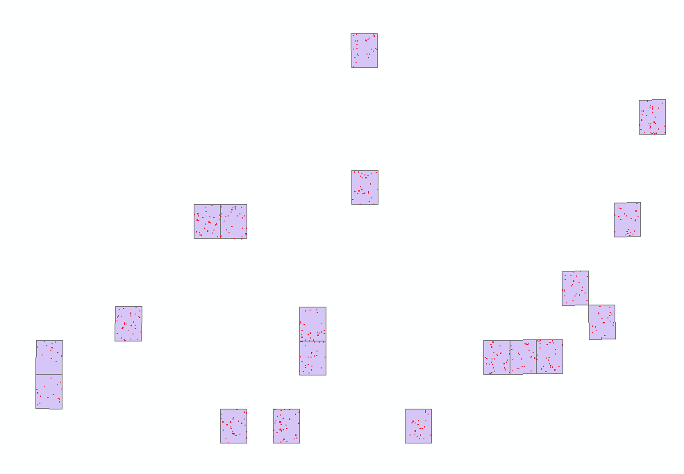
I'm in the process of classifiying NAIP imagery which will be used to generate training and validation for a Landsat model of tree cover. I've got 1348 random polygons scattered across 19 different NAIP tiles. In the left figure the purple polygons represent NAIP tiles and the tiny red dots are random points. Finding the cell count would involve 4 classes x 19 tiles = 76 runs of the Zonal Statistics tool in ArcGIS.
The Multiple Raster Zonal Statistics tool automates the process using two loops. First it loops through the NAIP tiles and then it loops through each class in the categorical raster. The resulting output has same number of polygons as the original input, but is attributed with cell counts from each categorical class. You can see on the map in the figure on the right that the polygons are colored according to percent tree cover.
Some caveats: You may need to edit the code slightly if you wish to process more than 4 categories. There are instructions on how to do so in the python script itself. Before running the tool you will also need an index shapefile attributed with the name of each raster image. I did this using the create bounding box for geodatasets tool in the Marine Geospatial Ecology Tools.