
Wednesday, November 30, 2016
Upcoming Great Basin LCC Webinar on Pygmy Rabbit

Thursday, November 17, 2016
Sarah Barga wins 2nd place in GSA poster contest

Wednesday, November 2, 2016
website overhaul on its way
Our lab is overhauling its website. The old and new website will have the same URL -https://naes.unr.edu/weisberg/ . We're expecting the new site to be out within the next couple of weeks. Expect an update when it is out.
Tuesday, October 25, 2016
New tool - Line Intercept Mapping for ArcGIS
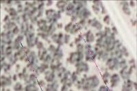
Line intercept is one of the most common sampling methods of sampling in ecology. Despite its widespread popularity a lack of tools exists for automatically importing and visualizing line interrcept data in a GIS. This tool alleviates this problem making line intercept mapping easier. The tool can be run using any of the three licensed versions of ArcGIS and does not require any extensions. The tool is capable of generating overlapping line segments. The tool does not require linear referencing because transect lines are assumed straight. The tool requires that your data be in two tables: a transect coordinate table and a start-stop table. The transect coordinate table should have four fields: a TransectID, easting (or longitude for the GCS version of the tool), northing (or latitude for the GCS version of the tool), and supposed line length (length of the line as measured in the field). The start-stop table requires four fields: a TransectID, a start distance, a stop distance, and at least one field with a descriptive attribute that you are trying to map.
New paper - Bending the carbon curve: fire management for carbon resilience under climate change
Our lab has a new paper "Bending the carbon curve: fire management for carbon resilience under climate change", which is about forest management and resilience. It suggests that active management, such fuel treatments and selecting for more drought-tolerant species, has the potential to capture and retain carbon long-term. The article was published in Landscape Ecology with Louise Loudermilk as the first author and Rob Scheller, Peter Weisberg, and Alec Kretchun as co-authors. You can check out their article HERE .
Comments on Prepare Rasters for Maxent versus Find ArcGIS Rasters and Project to Template in MGET
On my page for the Prepare Rasters for Maxent Tool for ArcGIS I made a comment about its application versus another tool called Find ArcGIS Rasters and Project to Template in the Marine Geospatial Ecology Toolbox. To access that page click HERE . Here is the text of that comment:
The Marine Geospatial Ecology Tools for ArcGIS (http://mgel.env.duke.edu/mget) is an excellent toolbox that includes much of the functionality of the Prepare Rasters for Maxent toolbox. I highly recommend checking it out. In particular, check out the Find ArcGIS Rasters and Project to Template tool which will batch project and clip all rasters to a template. One primary difference between that tool and Prepare Rasters for Maxent is that Prepare Rasters for Maxent has built-in steps to resample and fill in missing data. If you know that you have gaps in your data then Prepare Rasters for Maxent may be your best bet. If you don't think that you have gaps or they are minor then consider Find ArcGIS Rasters and Project to Template as a speedier alternative. You can create a template raster by multiplying all of your rasters together in the Raster Calculator. By default this will take the intersection of all of the rasters resulting in a template that is smaller than any one of the inputs.
The Marine Geospatial Ecology Tools for ArcGIS (http://mgel.env.duke.edu/mget) is an excellent toolbox that includes much of the functionality of the Prepare Rasters for Maxent toolbox. I highly recommend checking it out. In particular, check out the Find ArcGIS Rasters and Project to Template tool which will batch project and clip all rasters to a template. One primary difference between that tool and Prepare Rasters for Maxent is that Prepare Rasters for Maxent has built-in steps to resample and fill in missing data. If you know that you have gaps in your data then Prepare Rasters for Maxent may be your best bet. If you don't think that you have gaps or they are minor then consider Find ArcGIS Rasters and Project to Template as a speedier alternative. You can create a template raster by multiplying all of your rasters together in the Raster Calculator. By default this will take the intersection of all of the rasters resulting in a template that is smaller than any one of the inputs.
Wednesday, October 19, 2016
Creating non-spatial and "not quite true" spatial figures in GIS

The solution? What I call a "not quite true" spatial map. In the figure below we see that each bold box shows a trapping grid and each smaller box is a trapping station. The colors represent the intensity of some value. It may be the number of animals caught in the traps at the locations or some habitat variable having to do with plant cover or soil type. The reason why it is "not quite true" spatial is that distances among trapping grids is much larger than they are in real life and distances between individual traps isn't always exactly even. Nonetheless it shows spatial patterns in a succinct and compact form.

This is a nice reminder of how GIS can be a powerful tool for all sorts of visualizations, not just for maps. Using GIS we can very easily change color schemes using different kinds of classification s (i.e. natural breaks, quantiles, equal intervals, etc.), edit individual lines and polygons, convert from raster to vector formats. Some of this stuff is tedious to do in other types of software.
We're probably all familiar with some examples of "not quite true" spatial maps. Subway maps are a prime example. They are designed to show relative space, but distance isn't always accurate in the true geographic sense. However, we can also take raster GIS outside of the realm of normal geographic space and actually use GIS for displaying things like time series or even data space. More on that later.
Subscribe to:
Posts (Atom)