I got a request from a student recently who was interested in creating points so that he could visualize his quadrats on a map. With the advent of high resolution imagery it is now easy to get a sense of the layout of someone's field site. Overlaying quadrat and transect locations may also help find errors in the data. For example, if a forested plot shows more trees than are visible in an aerial photo this might serve as a red flag that there has been an error in data entry. By overlaying quadrats and transects on aerial photographs you may also be able to understand whether your random/stratified random/regular points/lines are representative of the site as a whole. I encourage field ecologists to take the extra steps to make their data spatially-explicit. This can be as simple recording a single set of XY coordinates + transect line distance + bearing and the distance of start/stop locations (quadrats) along the line. Consider also building map books so that you can quickly visualize what your field site looks like from a bird's eye perspective.
The new tool is called Split Straight Lines at Irregular Distances and runs in ArcGIS 10.1 (should work for other versions of ArcGIS as well). The tool also goes by the name Create Plots along Transects. To run this tool you'll need the following: 1) A point shapefile representing the start end of the transect attributed with XY coordinates, line distance, bearing (polar coodinates in degrees from north), and a unique ID field (FID will do). Make sure that you've declinated the bearing to account for the difference between magentic and true north.
2) A table with unique IDs for each line and distances along the line where points will be generated.
The tool was created in ArcGIS ModelBuilder and is fairly simple. The first step joins the tabular data to the point shapefile. Then the Bearing Distance to Line tool (standard tool in ArcMap - ArcToolbox - Data Management - Features - Bearing Distance to Lines) creates the lines. Finally the end points of those lines are converted to polygons. The end result is that you get a lien shapefile representing your transects and a point shapefile representing quadrats. Other GIS tools are also available on our lab's website.
With this blog I intend to share GIS, remote sensing, and spatial analysis tips, experiences, and techniques with others. Most of my work is in the field of Landscape Ecology, so there is a focus on ecological applications. Postings include tips and suggestions for data processing and day-to-day GIS tasks, links to my GIS tools and approaches, and links to scientific papers that I've been involved in.
Wednesday, January 28, 2015
Friday, January 23, 2015
New tool - Multiple Raster Zonal Statistics
I just released a new tool called Multiple Raster Zonal Statistics for ArcGIS 10.1. This handy little tool can pull attributes such as cell counts from a whole directory of classified rasters potentially saving a lot of time. I've also posted a link to it from our lab's download page.
Here is an example of how I've been using the tool.

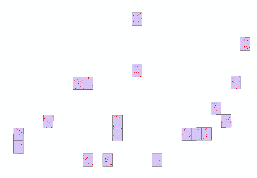
I'm in the process of classifiying NAIP imagery which will be used to generate training and validation for a Landsat model of tree cover. I've got 1348 random polygons scattered across 19 different NAIP tiles. In the left figure the purple polygons represent NAIP tiles and the tiny red dots are random points. Finding the cell count would involve 4 classes x 19 tiles = 76 runs of the Zonal Statistics tool in ArcGIS.
The Multiple Raster Zonal Statistics tool automates the process using two loops. First it loops through the NAIP tiles and then it loops through each class in the categorical raster. The resulting output has same number of polygons as the original input, but is attributed with cell counts from each categorical class. You can see on the map in the figure on the right that the polygons are colored according to percent tree cover.
Some caveats: You may need to edit the code slightly if you wish to process more than 4 categories. There are instructions on how to do so in the python script itself. Before running the tool you will also need an index shapefile attributed with the name of each raster image. I did this using the create bounding box for geodatasets tool in the Marine Geospatial Ecology Tools.
Here is an example of how I've been using the tool.

I'm in the process of classifiying NAIP imagery which will be used to generate training and validation for a Landsat model of tree cover. I've got 1348 random polygons scattered across 19 different NAIP tiles. In the left figure the purple polygons represent NAIP tiles and the tiny red dots are random points. Finding the cell count would involve 4 classes x 19 tiles = 76 runs of the Zonal Statistics tool in ArcGIS.
The Multiple Raster Zonal Statistics tool automates the process using two loops. First it loops through the NAIP tiles and then it loops through each class in the categorical raster. The resulting output has same number of polygons as the original input, but is attributed with cell counts from each categorical class. You can see on the map in the figure on the right that the polygons are colored according to percent tree cover.
Some caveats: You may need to edit the code slightly if you wish to process more than 4 categories. There are instructions on how to do so in the python script itself. Before running the tool you will also need an index shapefile attributed with the name of each raster image. I did this using the create bounding box for geodatasets tool in the Marine Geospatial Ecology Tools.
Subscribe to:
Comments (Atom)


