 Most GIS users are probably familiar with calculating flow accumulation and many are probably also familiar with weighted flow accumulation. ArcMap, however, will not allow negative weights and this can be a severe limitation in some cases. Fortunately, back in 2008 Bill Huber provided us with a simple yet elegant solution to this problem. However, I've noticed that this problem tends to resurface from time to time on the forums. A while back I put together a geoprocessing model to deal with this problem using Bill's solution which is available for download.
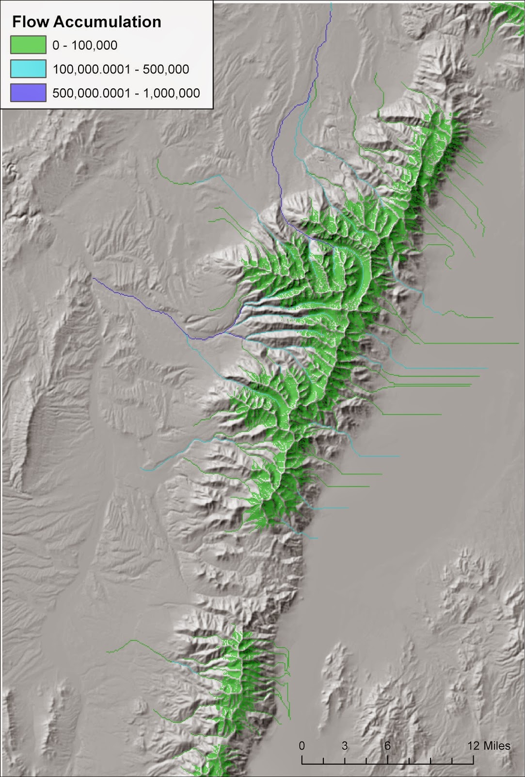
 The map on the right illustrates how a tool, such as this one, might be used. I first performed the two operations that precede flow accumulation: filling sinks and calculating flow direction. In this case I used a 30 meter USGS NED DEM. Then using my new tool I used a weight raster that consisted of rain + snowmelt minus evapotranspiration. In areas with positive values water is being released into the environment. In contrast, negative values highlight areas where evaporation is removing water from streams. In a typical flow accumulation operation flow accumulation only increases as one moves downstream. However, in arid environments we know that isn't true. Flows increase generally as one moves downstream due to multiple streams flowing into one another, but at some point flows begin to decrease because evaporation exceeds water inputs. The map above illustrates this in several places. Several streams flow out of the Ruby Mountains but many end when they flow into areas of high evaporation. Others flow off the map but are diminished before they leave the map.
This example also demonstrates that streams could be treated as dynamic entities dependent upon both precipitation and temperature. The data for the map above was derived using the Climatic Water Deficit Toolbox for the month of June. Later in the summer months flows may be diminished and connectivity for fish species may be impacted. In contrast, during the wetter months streams may become more connected. Finally, I should note that for the one instance where I compared a result like this to an actual hydrograph it didn't stack up so well. The streams went dry mid-summer in the flow accumulation model yet actual hydrograph data showed greatly diminished but still existent flows due inputs from groundwater. Nonetheless, these sorts of dynamic flow accumulation models are likely to be better than standard static flow accumulation models.

